RMIT Discovery to Device
Brand development and rollout for RMIT’s advanced medical manufacturing facility.
The $16.7 million Victorian Medical Device Prototyping and Scale-Up Facility bringing together entrepreneurs, start-ups, manufacturers, and researchers to collaboratively develop and advance new medical technologies for healthcare and diagnostics. We supported this mission by leading brand development, web design, and facade design for RMIT’s medical manufacturing facility, creating a cohesive visual identity across digital and physical touchpoints, including a launch website, custom lab prints, and environmental signage.
Process
Brand Development, Rollout, Facade Design, Website.
Role
Concept & Brand Development
Tools
Adobe Illustrator, Adobe XD, Figma
Timeline
1 year
Brand
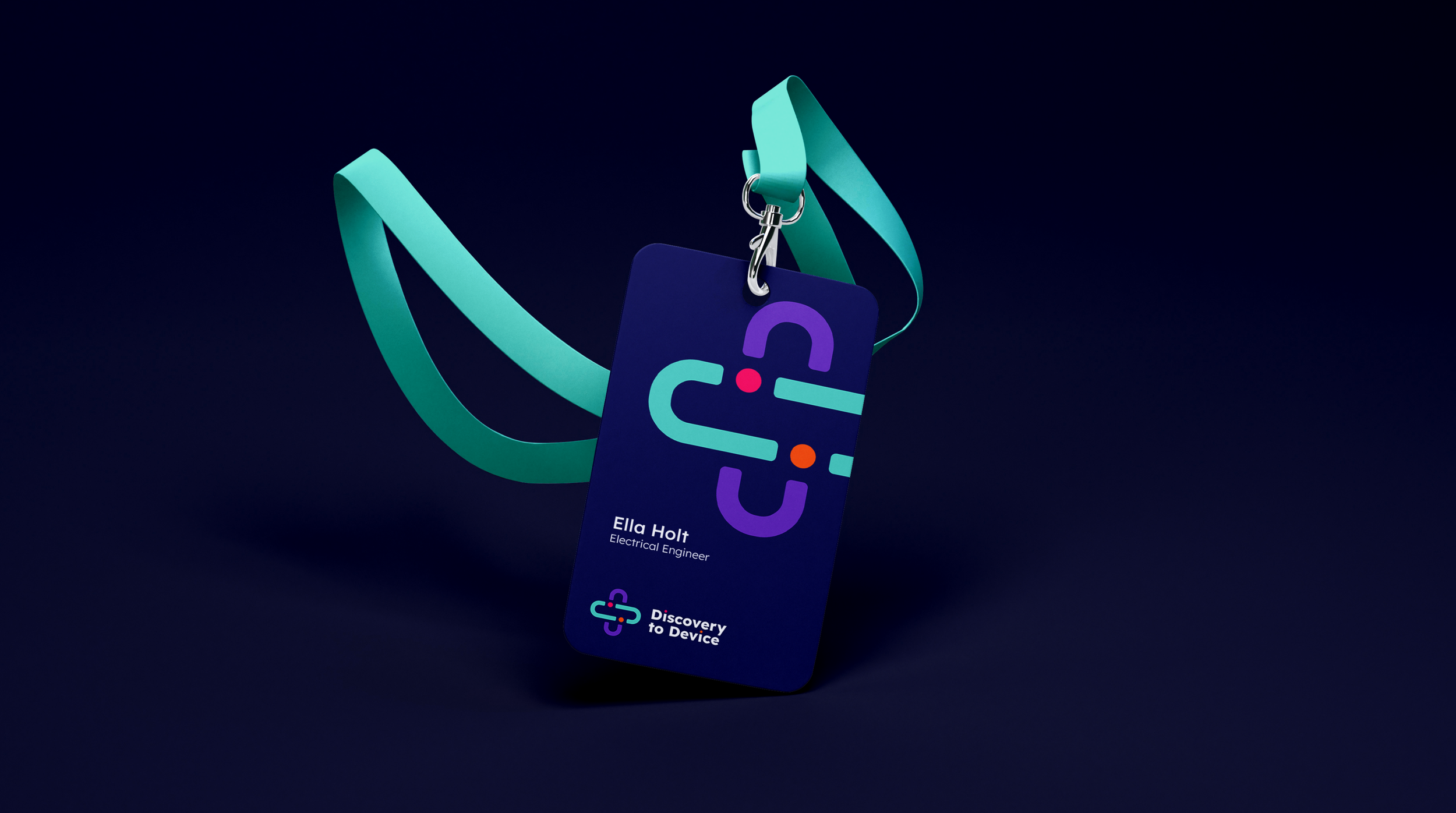
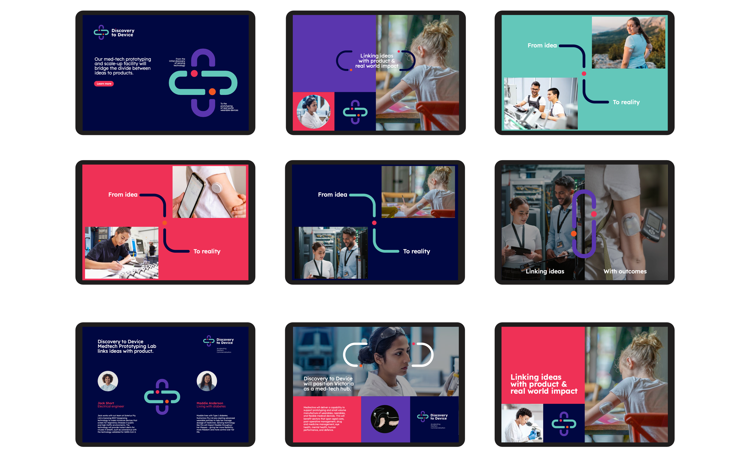
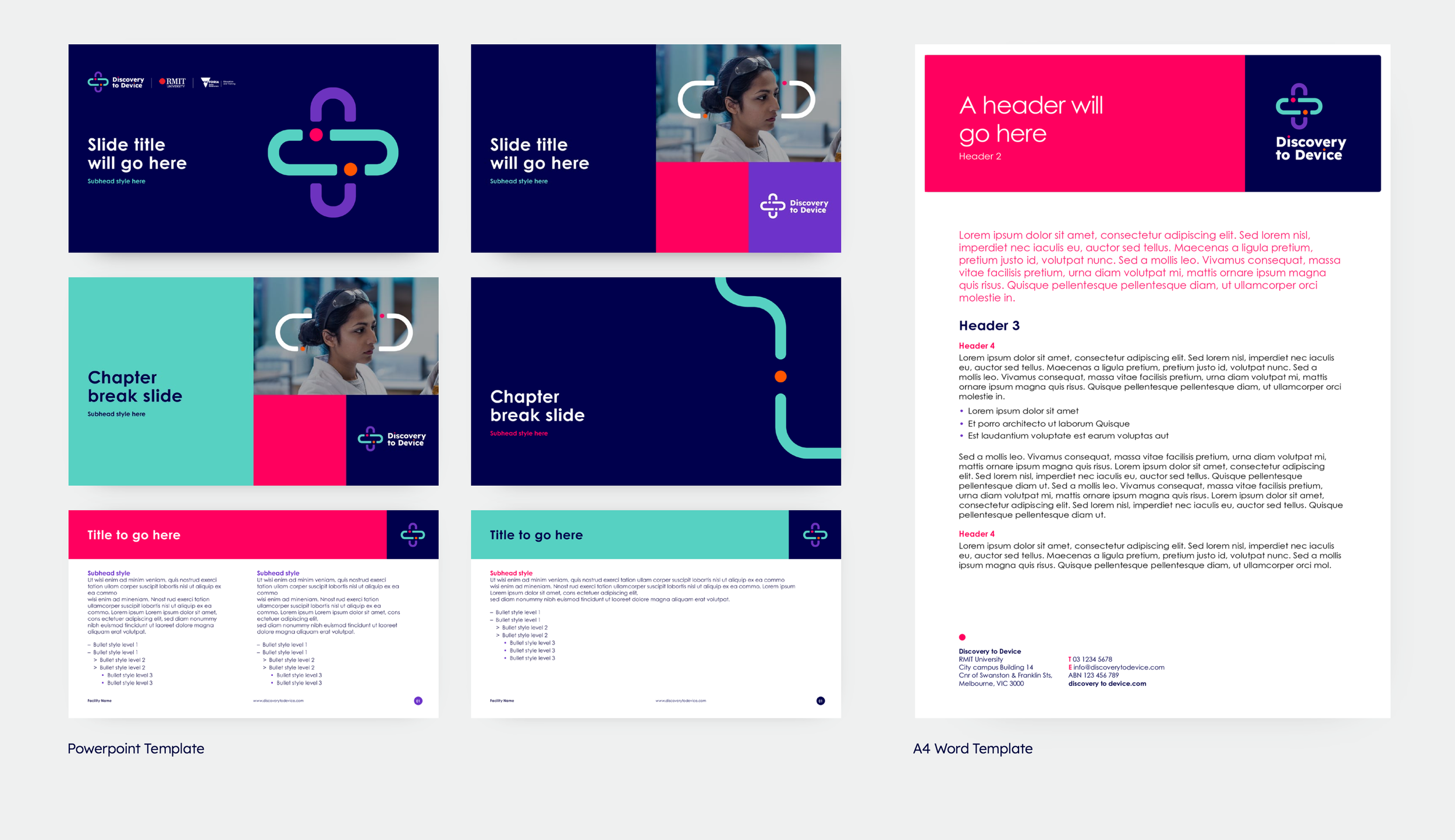
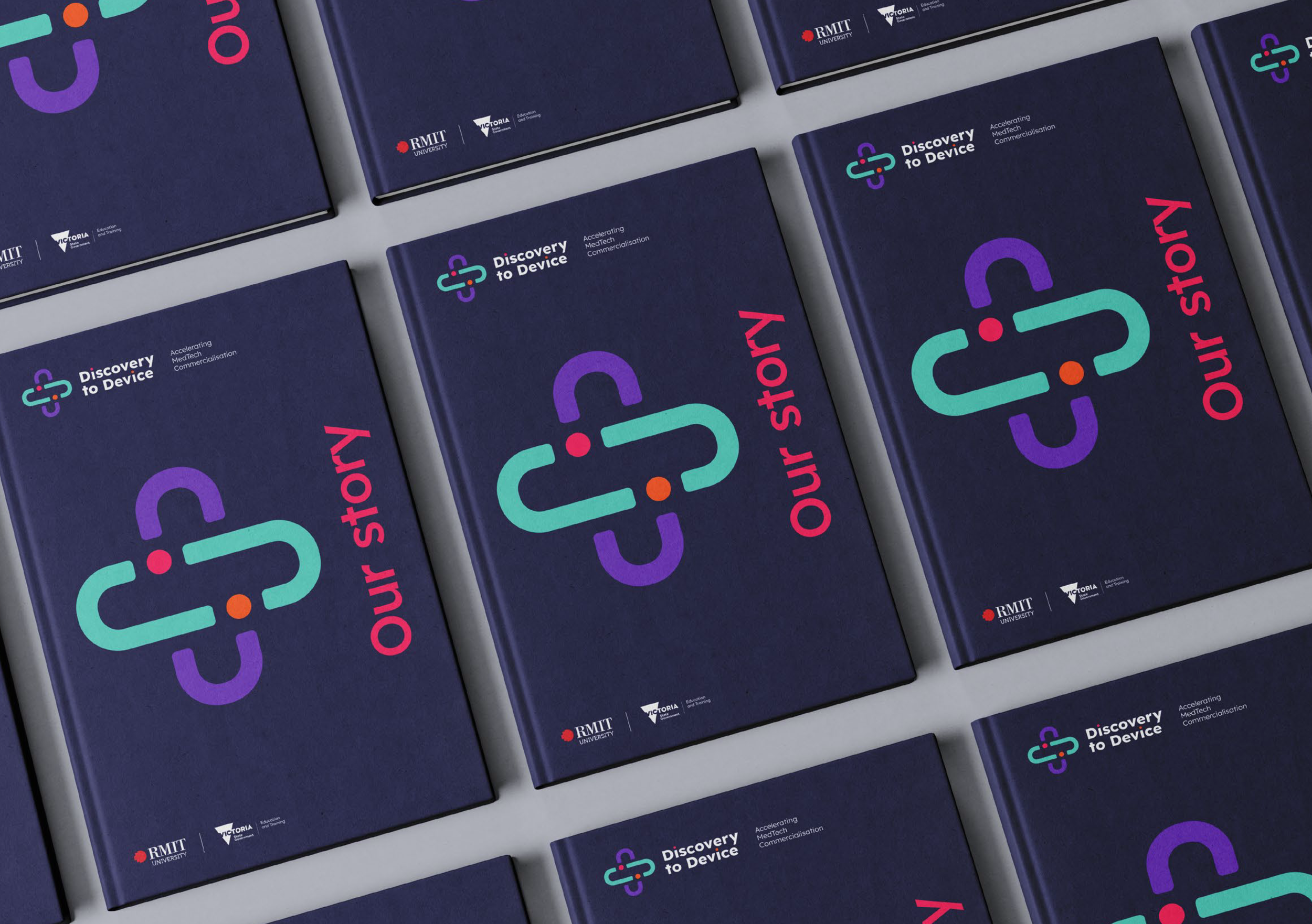
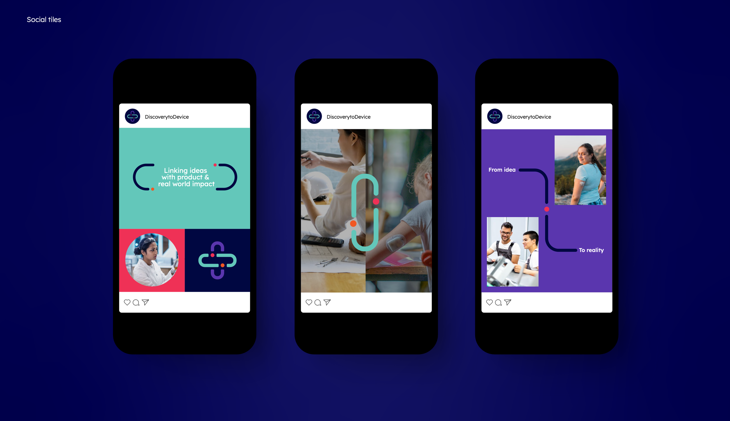
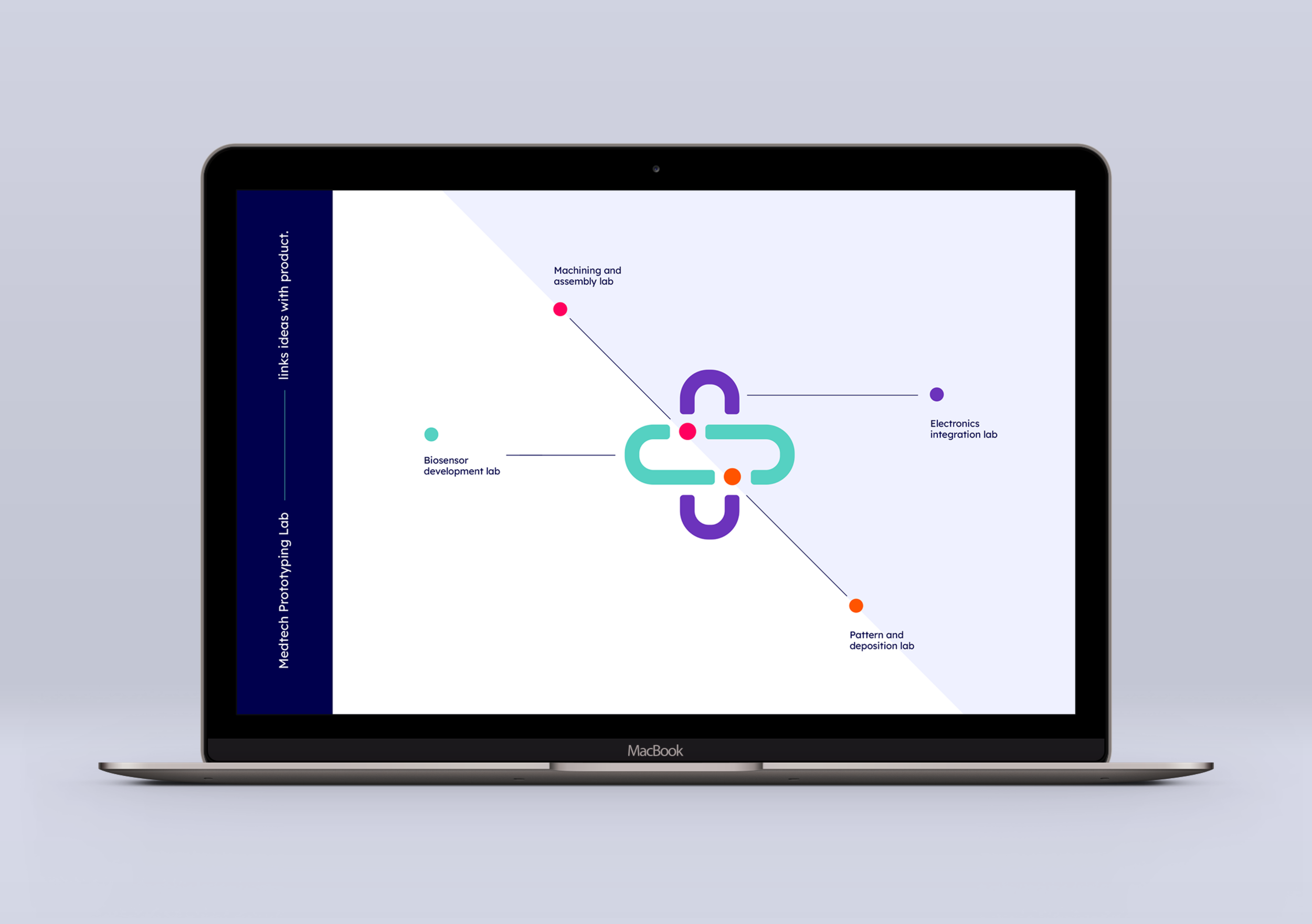
The development of the Discovery to Device brand is grounded in the core idea of linking and connection. At the heart of the strategy is the notion of bridging gaps between imagination and reality, ideas and products. This is expressed visually through the brandmark, whose fluid, interconnected form embodies the brand’s role as a unifying thread. Its structure reflects movement and flow, symbolising how Discovery to Device guides concepts through to creation, transforming abstract thinking into tangible outcomes.
Website
RMIT enlisted us to create a focused, one-page website to serve as the digital launchpad for their new brand. Their goal was to develop a site that was lean and impactful, one that aligned closely with their visual identity and communicated their mission to transform ideas into real-world medical solutions.
Challenge
With a single page to work with, every element needed to pull double duty, capturing attention, building credibility, and directing visitors toward call to actions. The design needed to:
Reflect the brand’s visionary energy and ethos.
Convey professionalism to researchers, healthcare partners, and entrepreneurs.
Communicate Discovery to Device’s core promise, bridging prototypes to products efficiently, without clutter or distraction.
Process & Insight
I began with strategic discovery: reviewing brand assets, dissecting visual tone, and understanding the target audience’s expectations. Inspired by the “Discovery to Device" ethos of turning ideas into tangible outcomes, I chose to structure the page as a concise narrative journey: mission, features (prototyping, scale-up), infrastructure, call-to-action.
Key considerations included:
Visual hierarchy: Hero section with bold tagline and refined imagery to convey innovation and trust.
Information flow: Modular blocks outlining infrastructure, expertise, and collaborative potential, each paired with a small coloured dot to indicate the different labs.
Navigation simplicity: Smooth in-page anchoring to allow instant access to key content.
Brand cohesiveness: Colours, fonts, and tone of voice reflect the identity previously developed and ensuring seamless brand continuity from environment (labs, signage, facade design) to web.
Solution
The delivered design features a streamlined single-scroll layout and polished typography. Each section draws the visitor along a logical path from brand purpose through capabilities. Subtle visual cues like highlighted text, directional arrows, and carefully spaced content guide the user intuitively toward discovery and engagement, mirroring the brand’s ethos of clarity and connectivity discoverytodevice.au.
Impact & Value
By distilling the narrative of Discovery to Device into an elegantly simple, one-page experience, the launch brief was fulfilled with maximum efficiency. The website now:
Establishes a strong visual and verbal identity at first glance.
Communicates credibility and purpose with precision.
Sets the stage for future expansion, whether into multi-page features, embedded content, or portals, built upon the same design foundations.
Facade design
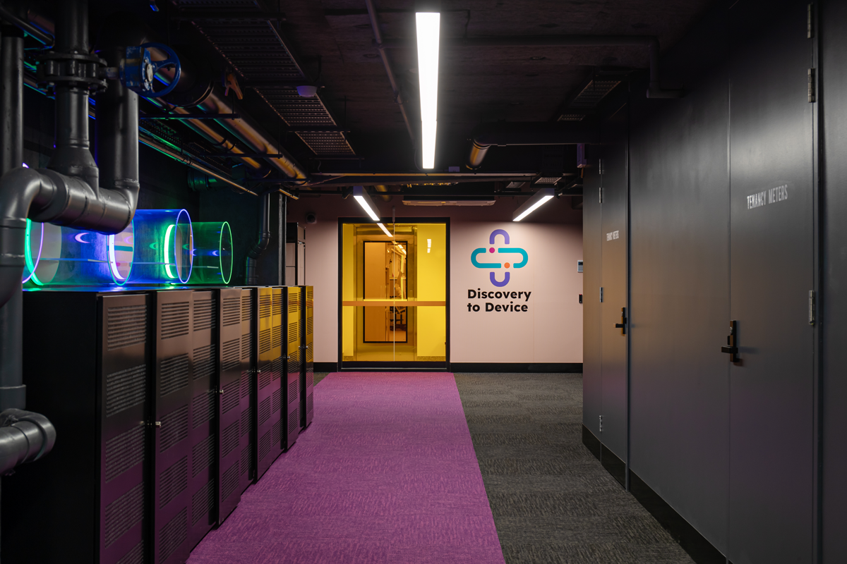
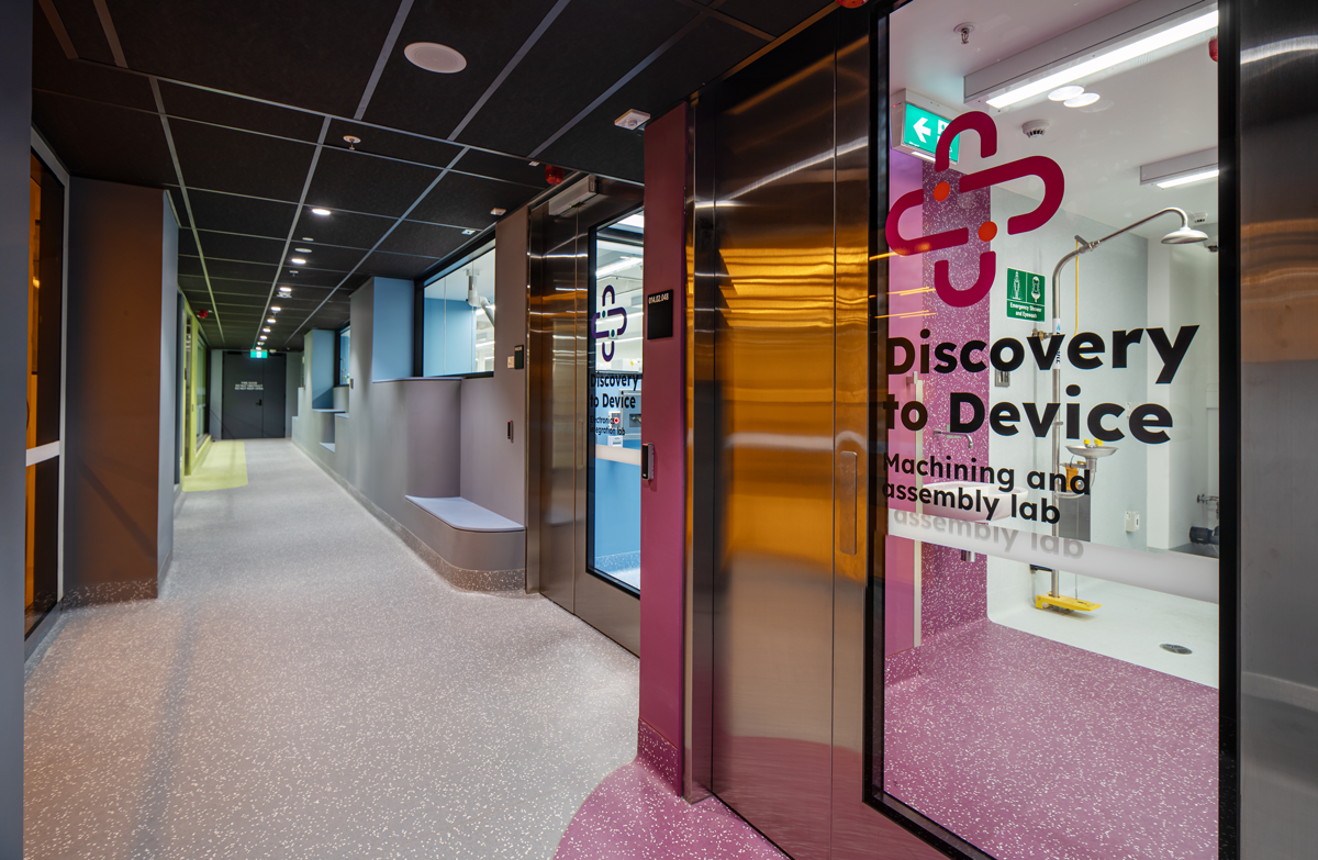
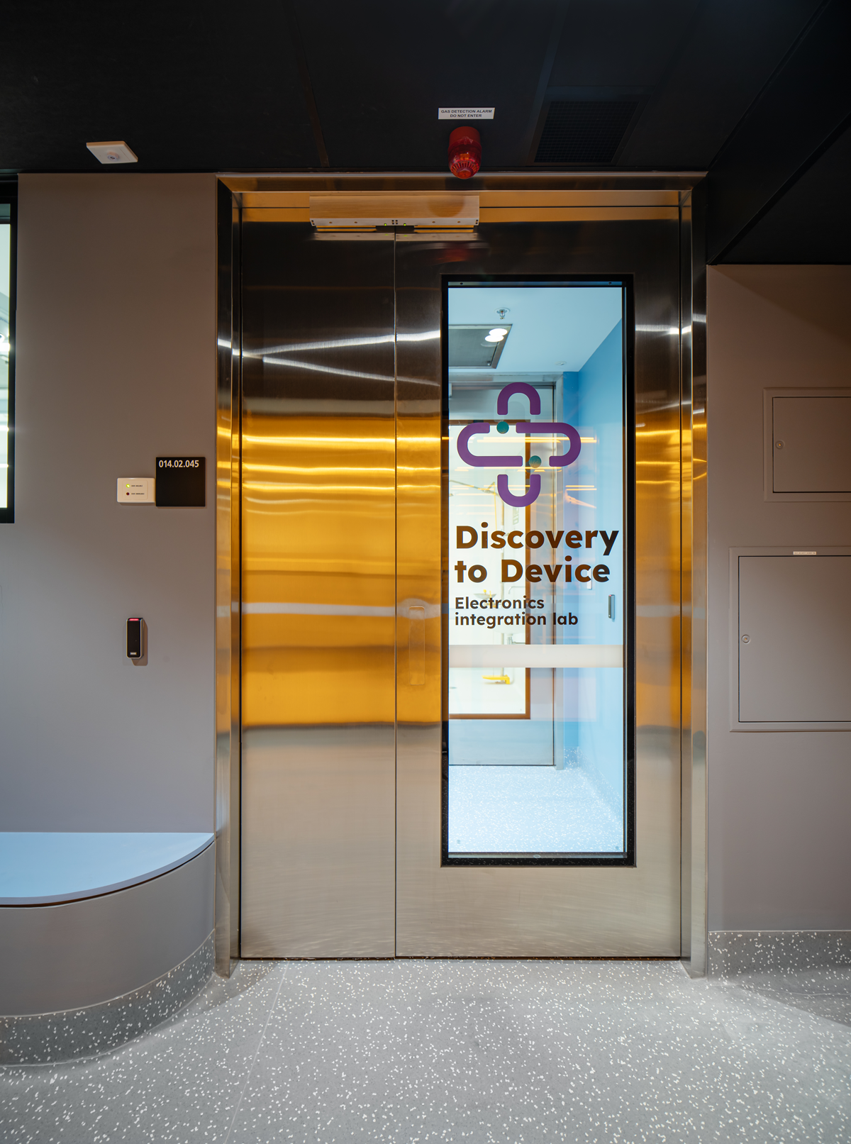
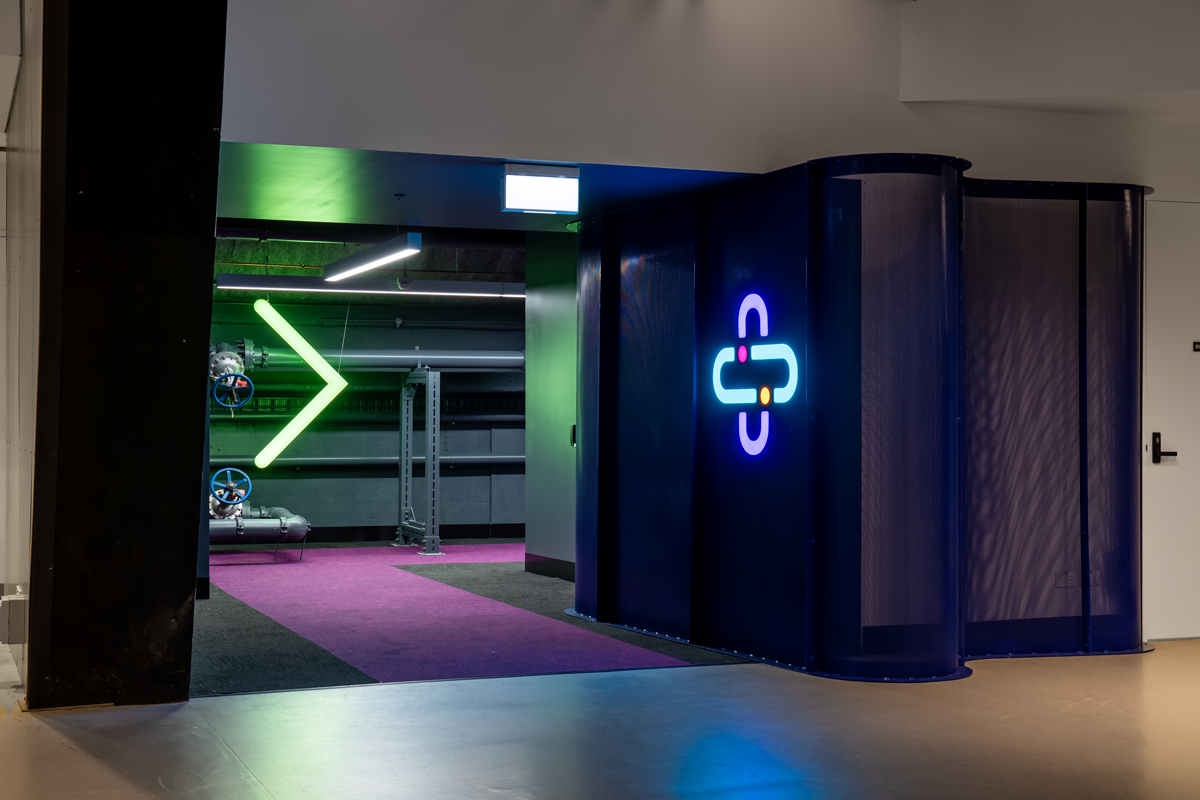
The university re-engaged us to extend their brand into the facade of their Melbourne CBD facility, with the goal of creating a more engaging and identifiable presence. Our approach began with the development of custom prints for each of the four labs, designed to give every space its own distinct identity while remaining connected through a cohesive visual system. To strengthen visibility and wayfinding, we introduced a bold neon logo and a reimagined entrance, establishing a clear sense of arrival for staff, students, and visitors. The result is a branded environment that not only enhances the experience of those who use the labs daily but also communicates the innovation and energy of the work taking place within.
What I learnt from this project
This project reinforced the importance of translating a brand’s visual identity consistently across digital touchpoints. Designing the one-page site required prioritising content, establishing a clear hierarchy, and maintaining consistency in typography, colour, and tone, ensuring the brand felt cohesive and professional while guiding users through a clear and engaging narrative.
