Swinburne University Wayfinding
Swinburne University’s new signage and wayfinding system is a user-focused project that reimagines campus navigation across the Hawthorn, Wantirna and Croydon campuses.
Developed through collaborative consultation, the system improves wayfinding for over 20,000 students annually by enhancing clarity, accessibility, and brand integration, contributing to a more intuitive and consistent campus experience.
Process
Wayfinding strategy, Concept development, Consultation, Mapping, Signage implementation.
Role
Designer and workshop facilitation.
Tools
Adobe Illustrator, Adobe InDesign
Timeline
3 years
The process
Through workshops and consultation with students, staff and executives, we identified key challenges and opportunities, leading to the creation of a new building naming convention, mapping system and signage family. Prototyping and user feedback were central to the design process, ensuring the final solution was both functional and fit-for-purpose. This experience deepened my interest in UX design, particularly in applying user insights to improve complex systems.
The problem
Students, staff, and visitors at Swinburne University experience difficulty navigating the campus environments due to inconsistent signage, unclear building naming conventions, and a lack of cohesive mapping systems. These issues created confusion, reduced accessibility, and detracted from the overall campus experience. A more intuitive, consistent, and user-informed wayfinding system was needed to support clearer navigation, improve the student experience, and better reflect the Swinburne brand across physical and digital touchpoints.
Workshop 01: Stakeholder Consultation
and Insights
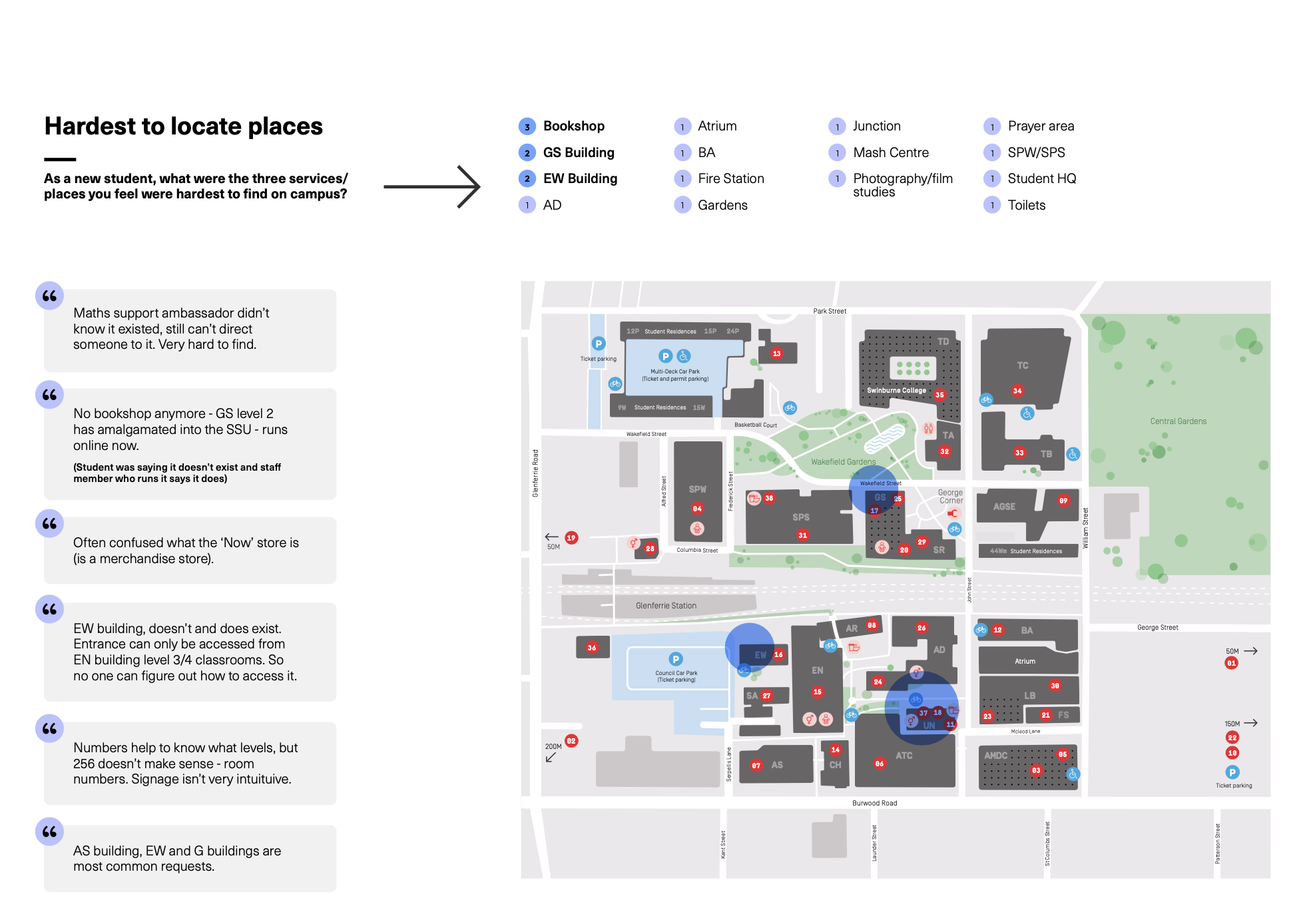
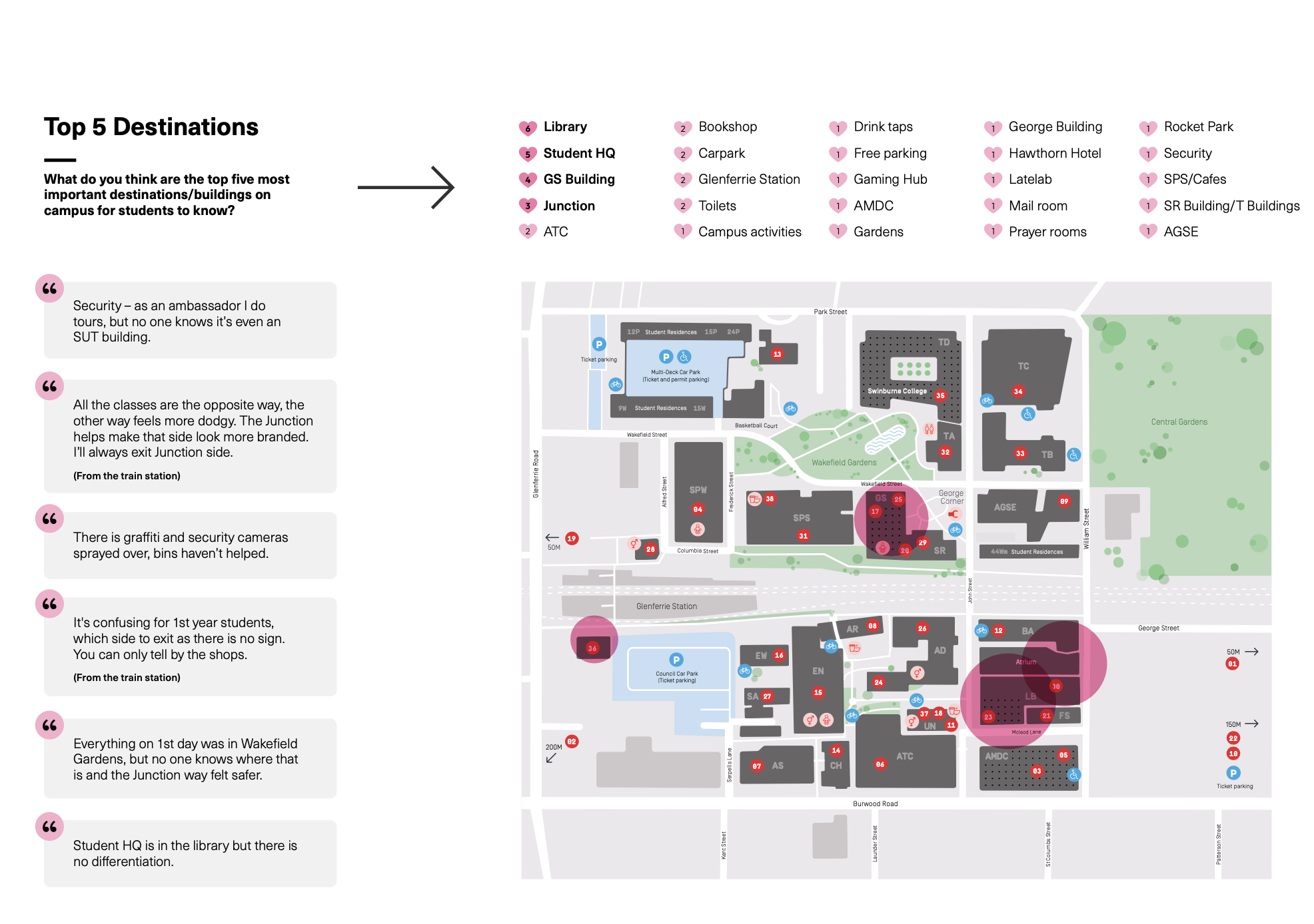
The first stakeholder workshop was conducted to better understand user experiences and pain points associated with Swinburne’s existing campus maps. Participants included a cross-section of students and staff, ensuring a diverse range of perspectives.
A series of collaborative exercises was used to capture qualitative insights. These focused on identifying key campus destinations, elements missing from the current wayfinding system, and preferences regarding colour palettes and overall map aesthetics.
While the visual design of the map was generally well received, several recurring issues emerged:
Label Clarity: Participants found the building codes and labels unclear and difficult to interpret. Frequently visited locations such as cafes, study areas, and key student services were often missing or poorly labelled.
Map Key Functionality: The structure of the map key was seen as misleading. Participants recommended organising the list alphabetically and ensuring numbered markers aligned logically with locations on the map.
Navigation Challenges: Students consistently reported difficulties locating specific destinations, suggesting the current labelling system isn’t supporting intuitive navigation.
These insights highlighted critical gaps in the map’s information architecture and user flow. Rather than minor visual tweaks, the findings revealed a need for not just as a directional tool, but as a user experience touchpoint that reflects the campus’ identity and supports a more seamless, inclusive navigation experience.
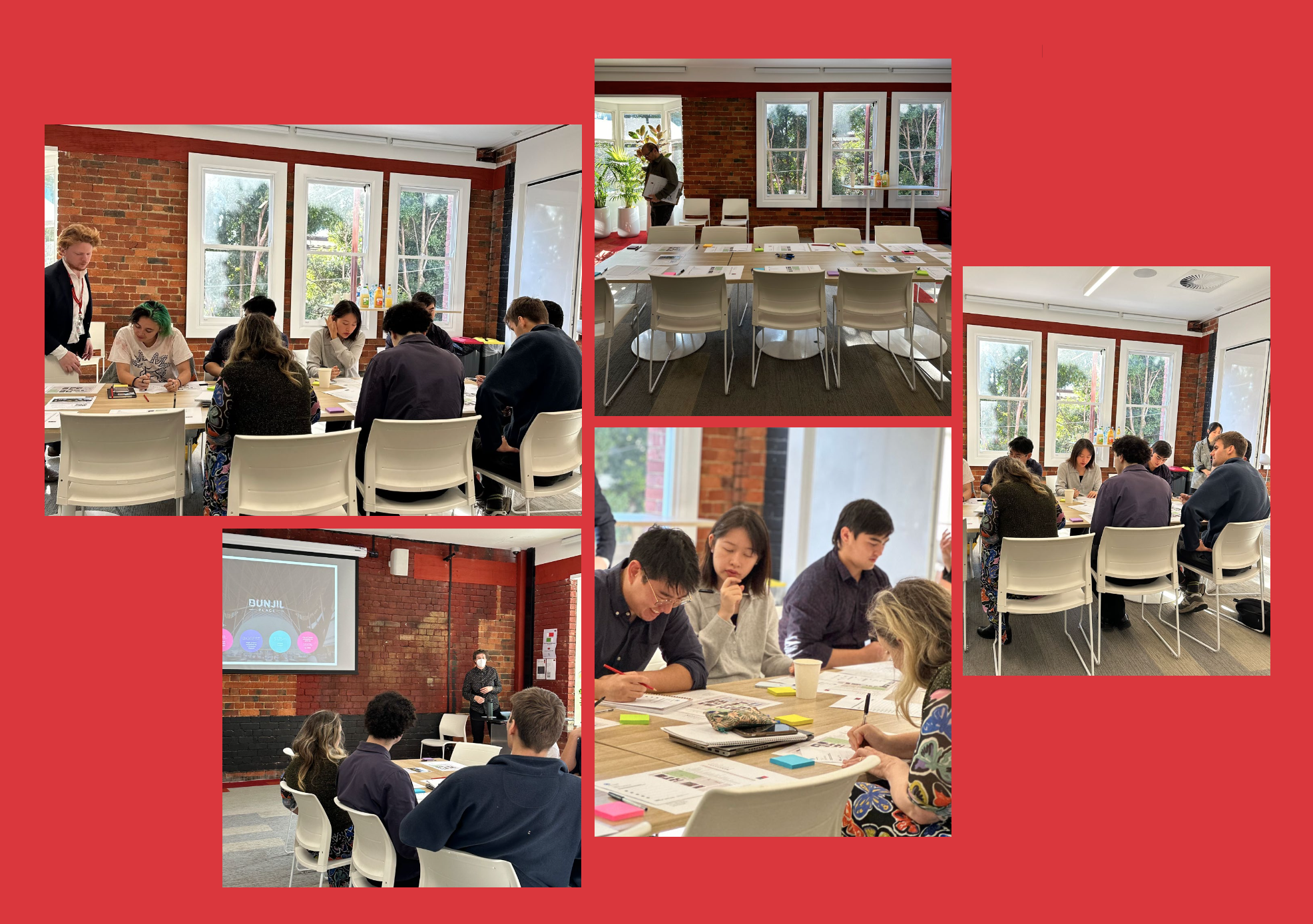
Workshop 02: Prototype Testing and Iteration
Following the initial round of feedback, a second workshop was conducted to test updated map prototypes and assess the effectiveness of implemented changes. This session aimed to validate design decisions and gather further input from both students and staff.
Key improvements included:
Clearer labelling of high-traffic destinations such as ‘The Junction’ and ‘Student HQ’
Integration of alphabetical building codes with a logical, sequential numerical key, and visually coupling with into a single capsule
Reorganisation of building codes to follow a consistent numerical pattern
Incorporation of the PTV colour palette, using PTV blue to highlight Glenferrie Station as a key transport landmark
Addition of bridge connections and building entry points to support better spatial orientation and wayfinding
Participants, seated in small groups, evaluated specific design elements in isolation, such as the use of numerical vs alphabetical keys and overall colour treatment (dark vs light building footprint). This step-by-step approach was designed to prevent participants from feeling overwhelmed and to focus on isolating key preferences without the distraction of additional elements.
While a few preferred the alphabetical key, most users found the numerical sequencing most intuitive. The lighter colour palette was favoured for its readability, though suggestions were made to increase contrast between buildings and building code capsules for improved visual distinction.
Light Map
Dark Map
Final map
In response to feedback from the second student workshop, final refinements were made before the map was implemented across the full signage suite. These included increasing the contrast between building code capsules and building footprints for better legibility, as well as adding the previously omitted George Street buildings, which had not fit within the original map frame.
Throughout the process, design decisions were continually shaped by feedback and testing. Map prototypes were iterated based on real user feedback, balancing visual clarity with practical functionality. The result is a more consistent, legible, and much more ‘branded’ experience wayfinding system that supports the needs of over 20,000 on-site students across Swinburne’s three campuses.
My role in this project spanned research, facilitation, and design. From facilitating workshops to refining prototypes based on user feedback, I was closely involved at every stage. This project reinforced the value of inclusive, research-led decision-making and taught me how even small improvements in clarity and flow can have a meaningful impact on how people move through and connect with a space.
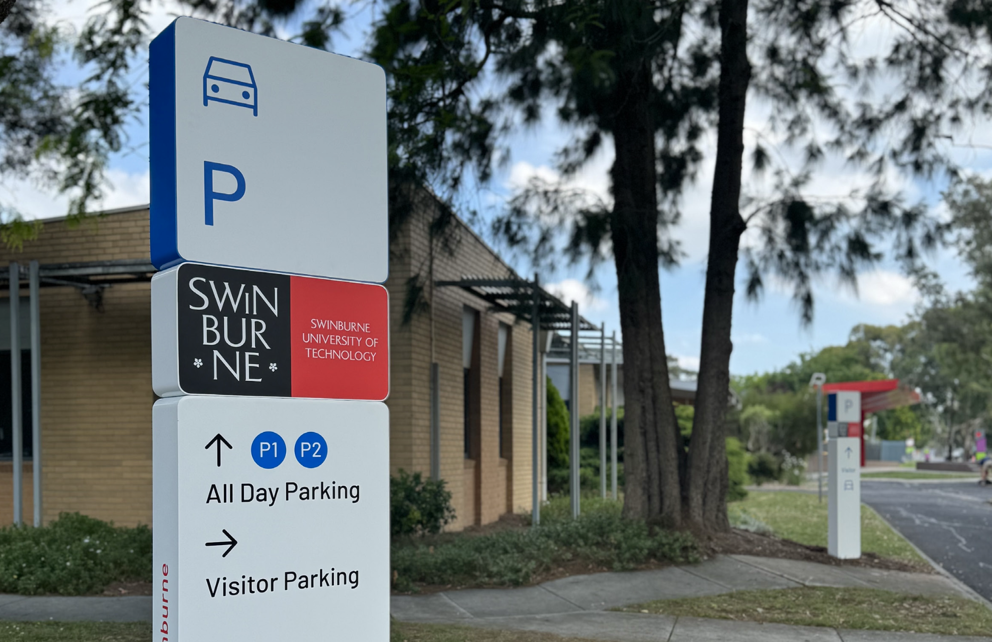
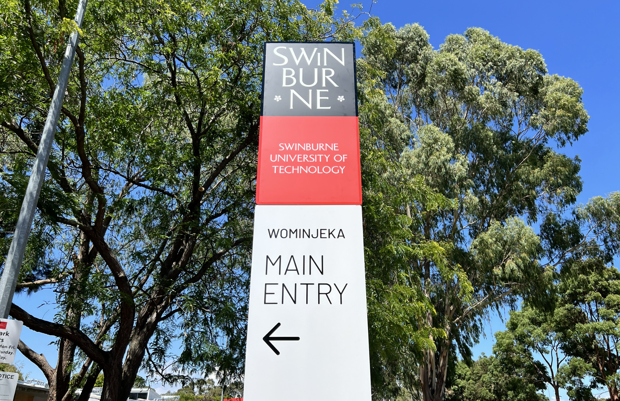
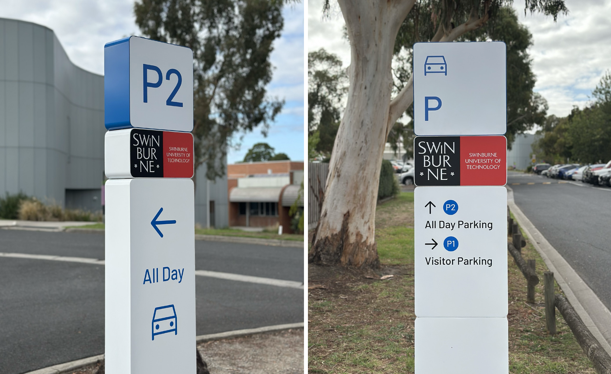
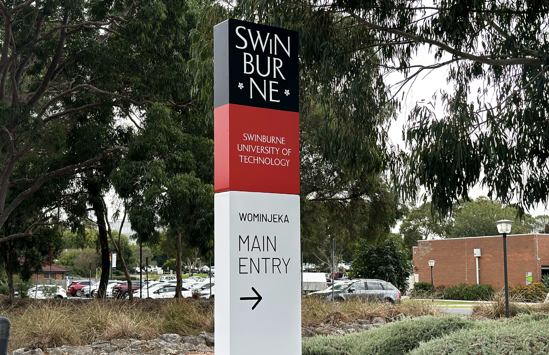
Signage Family integration at Wantirna and Croydon
